

basic popover
This block is part of the Component UI group and was last modified in core v10.4.28.
basic popover v10.4.28 Basic bootstrap popover
In pins 3
- content required
uicomponent - popover required
uicomponent - Position required
valuetop | right | bottom | left
Out pins 1
- uicomponent
uicomponent
tooltip |
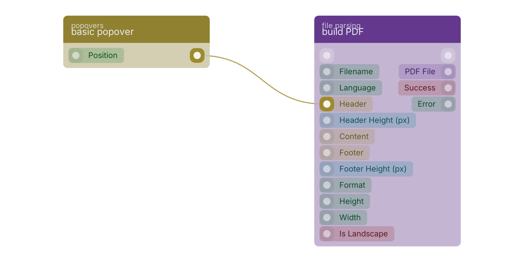
A typical wiring for basic popover: the uicomponent out pin feeds build PDF.
Version history
Introduced in v10.4.28.
Back to
Component UI Return to the main group to view all sub-groups Back to popovers Return to the group to view all blocks within this group